In this instance, it's more to show off and, possibly, let someone see one of them they've never seen before. Here goes...
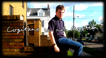
The fault is mainly with the original shot, with this one...I was brutally forced by my own thoughtlessness to shrink my header down to an abysmal half its potential size. The shot itself was fine, it's just that I really should have had a wider one. Kept the script from the last one, changed it to white, and added a shadow behind it to make it visible.
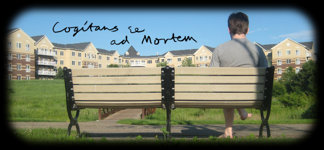
This is probably one of the ones I'm most proud of. The photographic opportunities I miss all the time just because I don't want to go out of my way are depressing. This one time, I had the time to, so I did. EPIC, if I may say so. (GAH. Just noticed this is one of the versions that cuts off to black, instead of fading to black. I hate that.)
Updated version. Fades to black fine, but I really liked the contrast better on the other one. Reorganized the words a tad.
Less proud of this one, mostly because of the illegible scrawl I used for it. The two are different, if you'll notice. Daddy took the picture.
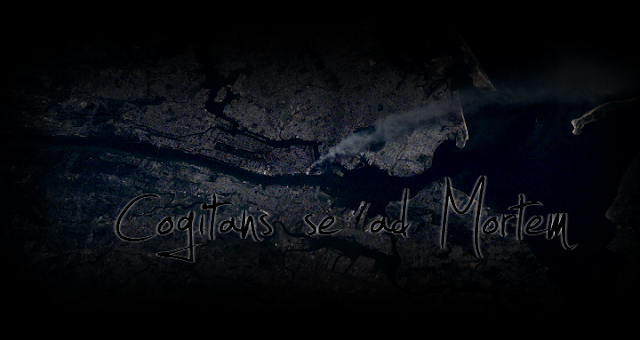
The first 9/11 one. Blahish.
The second 9/11 one. Getting there...text visibility was probably decreased from the former, depressingly.
This one is another I'm rather proud of. The occasion, for those who don't remember and/or are new to my blog, was 9/11/09. I got a picture of Manhattan from space around that time, did a bunch in Gimp with it, and then posted it. First time around, I have to admit, I really didn't do a great job of it. To be truthful, that's usually the occasion. I usually make at least two updated versions of a header, and use the last 'til I get new inspiration. In this case, Mr. Denhoed provided constructive criticism, resulting in the above masterpiece of degrees.
THE REALLY RECENT STUFF (EXPANDED FORM)
This is a new thing. I was moseying along on the Google blog (or was it the Blogger blog? Yeah, I think so.) when I saw a bunch of WORDS organized FANTASTICALLY. I obviously had to figure out how to do it myself, and, within the day, I'd figured the thing out.
The result? A preliminary, fairly boring (in my opinion) header that, being an original version, needed improvement.
Thus,
This one's using the Microsoft font, Calibri (bold). I also added some shading using Inkscape, which was a fantastic improvement, and increased the readability of the background text significantly. The shading on the blog title font is especially interesting, because I duplicated the original, blurred it, changed it to black, and increased the transparency a bit. The result was pleasing, but a friend thought the Capture It font of the former was its heart and soul, so...
I have to say I'm not fantastically proud of this one...I think the shadow, in specific, is kind of annoyingly far away from its, uh, thing, but, overall, I think it's a good improvement. I think I'll probably update this one again tomorrow or so.
Well, depressingly, that's all for now. I hope you enjoyed it! (if you'd like me to explain what I did in more detail, feel free to ask for it, but I dunno if I'll ever do it...)
UPDATE! ANCIENT HISTORY!
Seriously, I just dug this up/remembered it now! These are some of the earliest headers I ever made for CSAM.
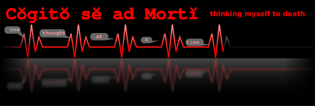
Possibly the first ever render for CSAM. I was into fixed-width fonts at that time, and felt like including the accents. Cogito se ad Morti...not sure where I got the original, but Gabriel set me straight a little bit later, and that's how we're here now.
Significantly better. I moved the horizon, for some reason...and changed EVERYTHING to red, except the horizon thingy. Lined up the one thought at a time thing, but the fade to black thing wasn't being kind to Mr. One over on the left. Changed the fonts, fixed the grammar.
Increased the font size on the thinking myself to death bit, and changed things with the heartbeath thing so it wasn't fading to black before it should.
Now, people, don't complain I put up too many intermittent steps. There are a lot more, and I don't complain at all! Anywho, I hope you enjoyed that.
(EDIT) the edges of the three last pictures are a complete fluke. I seriously have no idea how that happened. Then again, that was more than a year ago.
!Noah!


No comments:
Post a Comment